5 Blogs
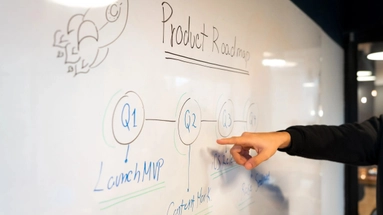
Building a full-featured product without validating the idea is one of the biggest mistakes startups make. An MVP (Minimum Viable Product) allows founders to test assumptions quickly and cost-effectively.What is an MVP?An MVP is the simplest version of your product that solves the core problem for your users. It focuses only on essential features.Be
Coaching im 21. Jahrhundert: Warum persönliche Entwicklung heute wichtiger ist denn jeStell dir vor, du sitzt im Cockpit eines Flugzeugs – alle Instrumente leuchten, der Motor läuft, aber du weißt nicht, wo du landen willst. Genau so fühlt sich das Leben vieler Menschen heute an: viel Energie, viel Potenzial – aber keine klare Richtung. Coaching ist der Fluglotse, der dir hilft, sicher
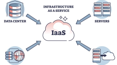
Scalability is one of the most important factors in SaaS success. Without proper infrastructure, even a great product can fail under high user demand.Why Cloud Infrastructure MattersCloud platforms provide:On-demand scalabilityCost optimizationGlobal availabilityHigh reliability

Artificial Intelligence is no longer a futuristic concept, it has become a core component of modern web applications. From intelligent chatbots to predictive analytics, AI is transforming how businesses build and scale digital products.Why AI Matters in Web DevelopmentAI enhances user experience through personalization. Platforms like Netflix and Amazon use AI-dri

Lorem ipsum dolor sit amet consectetur adipisicing elit. Illo impedit est maxime quidem aliquam, distinctio ullam debitis blanditiis ducimus commodi alias autem nisi deleniti, sequi rem mollitia ea quod perferendis. Lorem ipsum dolor sit amet consectetur adipisicing elit. Illo impedit est maxime quidem aliquam, distinctio ullam debitis blanditiis ducimus commodi alias autem nisi deleniti